Power your breakpoints game with SASS mixins
When working on responsive websites, you will often want to adapt to the user's screen width so your content could be responsive. SASS mixins allow you to do it in a readable and maintanable way.
Imagine you want to use two breakpoints for your website: 640px and 1024px. You will therefore handle three screen sizes: small (639px and less), medium (640px to 1023px), and big (1024px and more).
// Exported to use along with the mixins
$small: small;
$medium: medium;
$big: big;
$smallAndMedium: smallAndMedium;
$mediumAndBig: mediumAndBig;

@mixin breakpoint($size) {
  $break-medium: 640px;
  $break-big: 1024px;

  // 639px and less
  @if $size == $small {
    @media all and (max-width: $break-medium - 0.5px) {
      @content;
    }
  }

  // Between 640px and 1023px
  @else if $size == $medium {
    @media all and (min-width: $break-medium) and (max-width: $break-big - 0.5px) {
      @content;
    }
  }

  // 1024px and more
  @else if $size == $big {
    @media all and (min-width: $break-big) {
      @content;
    }
  }

  // 1023px and less
  @else if $size == $smallAndMedium {
    @media all and (max-width: $break-big - 0.5px) {
      @content;
    }
  }

  // 640px and more
  @else if $size == $mediumAndBig {
    @media all and (min-width: $break-medium) {
      @content;
    }
  }
}
Notice how I used - 0.5px after each max-width to avoid having one non covered pixel where the breakpoints meet.
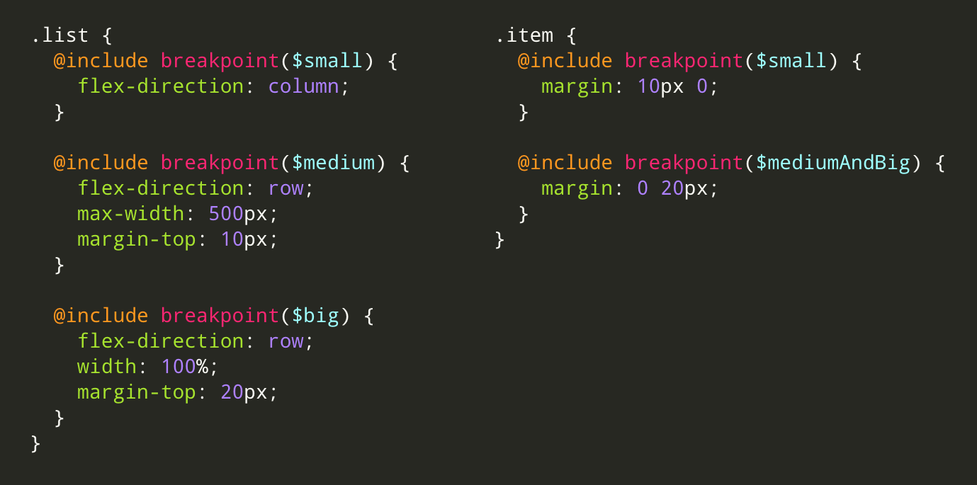
And you can use your new mixins easily like so:
@import 'breakpoints.scss';

@include breakpoint($smallAndMedium) {
  .list {
    flex-direction: column;

    .item {
      margin: 10px 0;
    }
  }
}

@include breakpoint($big) {
  .list {
    flex-direction: row;

    .item {
      margin: 0 10px;
    }
  }
}
Et voila! To help you define your beakpoints, you can use this site which gathers information on various mobile devices.